ARIA in HTML
This document is a practical guide for developers on how to add accessibility information to HTML elements using the Accessible Rich Internet Applications specification [WAI-ARIA-1.1], which defines a way to make Web content and Web applications more accessible to people with disabilities. This document demonstrates how to use WAI-ARIA in HTML5, it especially helps with dynamic content and advanced user interface controls developed with Ajax, HTML, JavaScript, and related technologies.
This document provides advice for use of ARIA attributes in [HTML51].
For general best-practice information about using ARIA, see the [wai-aria-practices-1.1] document.
The following is a longer list of resources that provide relevant information:
- ARIA in HTML
- WAI-ARIA 1.1 Authoring Practices
- Accessible Rich Internet Applications (WAI-ARIA) 1.1
- HTML 5.1
- HTML5 Accessibility
Notes on ARIA Use in HTML
1. First Rule of ARIA Use
If you can use a native HTML element [HTML51] or attribute with the semantics and behavior you require already built in, instead of re-purposing an element and adding an ARIA role, state or property to make it accessible, then do so.
Under what circumstances may this not be possible?
- If the feature is available in HTML [HTML51] but it is not implemented or it is implemented, but accessibility support is not.
- If the visual design constraints rule out the use of a particular native element, because the element cannot be styled as required.
- If the feature is not currently available in HTML.
2. Second Rule of ARIA Use
Do not change native semantics, unless you really have to.
For example: Developer wants to build a heading that's a tab.
Do not do this:
<h2 role=tab>heading tab</h2>Do this:
<div role=tab><h2>heading tab</h2></div>NOTE
If a non-interactive element is used as the basis for an interactive element, developers have to add the semantics using ARIA and the appropriate interaction behavior using scripting. In the case of a button, for example, it is much better and easier to Just use a (native HTML) button.
NOTE
It is OK to use native HTML elements, that have similar semantics to ARIA roles used, for fallback. For example, using HTML list elements for the skeleton of an ARIA-enabled, scripted tree widget.
3. Third Rule of ARIA Use
All interactive ARIA controls must be usable with the keyboard.
If you create a widget that a user can click or tap or drag or drop or slide or scroll, a user must also be able to navigate to the widget and perform an equivalent action using the keyboard.
All interactive widgets must be scripted to respond to standard keystrokes or keystroke combinations where applicable.
For example, if using role=button the element must be able to receive focus and a user must be able to activate the action associated with the element using both the enter (on WIN OS) or return (MAC OS) and the space key.
Refer to the Design Patterns and Widgets and Developing a Keyboard Interface sections of [wai-aria-practices-1.1]
4. Fourth Rule of ARIA Use
Do not use role="presentation" or aria-hidden="true" on a focusable element .
Using either of these on a focusable element will result in some users focusing on 'nothing'.
Do not do this:
<button role=presentation>press me</button>Do not do this:
<button aria-hidden="true">press me</button>NOTE
Applying aria-hidden to a parent/ancestor of a visible interactive element will also result in the interactive element being hidden, so don't do this either:
<div aria-hidden="true">
<button>press me</button>
</div>
NOTE
If an interactive element cannot be seen or interacted with, then you can apply aria-hidden, as long as it's not focusable. For example:
button {opacity:0}

<button tabindex="-1" aria-hidden="true">press me</button>
NOTE
If an interactive element is hidden using display:none or visibility:hidden (either on the element itself, or any of the element's ancestors), it won't be focusable, and it will also be removed from the accessibility tree. This makes the addition of aria-hidden="true" or explicitly setting tabindex="-1" unnecessary.
5. Fifth Rule of ARIA Use
All interactive elements must have an accessible name.
An interactive element only has an accessible name when its Accessibility API accessible name (or equivalent) property has a value.
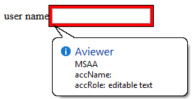
For example, the input type=text in the code example below has a visible label 'user name' , but no accessible name:
    user name <input type="text">

    or

    <span>user name</span> <input type="text">
The control's MSAA accName property is empty:
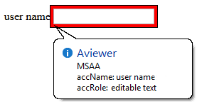
In comparison, the input type=text in the code example below has a visible label 'user name' and an accessible name. This example has an accessible name because the input element is a labelable element and the label element is used correctly to associate the label text with the input.
<!-- Note: use of for/id or wrapping label around text
and control methods will result in an accessible name -->

<input type="text" aria-label="User Name">

or

<span id="p1">user name</span> <input type="text" aria-labelledby="p1">
The control's MSAA accName property has a value of "user name":
NOTE
Note: The example above is for ARIA widgets. For regular HTML inputs, follow the First Rule of ARIA, and use the label element with a for attribute to associate labels with input elements.